Associate Professor Alex Papadopoulos of the Department of Geography is using maps, GIS and pre-census era documentation to reveal potential new political dimensions in Vincent de Paul (1581-1660). Notably, it’s the first project to use the methods of Geographic Information Systems (GIS) to investigate Vincentian studies.
“It is an original way to explore early modern state formation in the age of the Reformation and Counter-Reformation,” Alex explained. “Vincentian research is so connected to such vital political and social change. The 17th Century is the era in which political modernization emerges, and the Vincentians are there—as agents of the early modernization of the Catholic Church.”
Driving Alex’s inquiry is “Vincent’s own story and his place in this Crown-Church alliance,” he said. As confessor to Louis XIII—even attending to the king on his deathbed—Vincent was on intimate terms with the monarchy. During the regency of Louis’ son and successor Louis XIV, Anne of Austria, the future Sun King’s mother, appointed Vincent to the Council of Conscience, the body responsible for choosing bishops—a very political charge, Alex noted. “It is a natural extension of that logic to assume his actions have a political, not just a social, context.”
A Vincentian Endowment Fund Grant is supporting the historical GIS project entitled, “The Geopolitics of Vincentian Praxis: Containing the Reform Church and Supporting the Crown through a Public Assistance Strategy”. Alex hypothesizes that there is a geo-spatial correlation between the choice of locations for the seminaries, hospitals, charitable and other Vincentian institutions established in France starting in the first quarter of the 17th Century and the locations of Huguenot places de sûreté (security places) including Reform churches, castles, fortified villages and towns held by the minority French Protestants.
He’s using period maps, along with data found in marriage records, wills and contracts to plot the geographical locations and test his further hypothesis: that Vincentian activity was most pronounced in areas of geopolitical significance, such as unstable borderlands, contested territory or strategic locations dividing the two opposing populations. Mappable, physical evidence of the strategic placement of Vincentian installations could alter our perspective on Vincent’s political motivations and involvement at a vital historical moment in the formation of the early modern territorial state. “Such action would have assisted the Crown, firstly, in consolidating Catholic rule across France, and, secondly, in promulgating state centralization,” Alex maintains.
Now in the “thick of analysis” stage, the project is a team effort. Research Assistant Aidan Schenkus, a Geography major and graduating senior, is familiar with GIS. He’s tending to that aspect of the project and helping Alex organize the database while learning how to think spatially about politics. Nandhini Gulasingam of the SSRC and Cassandra Follett, Geography’s newly recruited GIS Coordinator, are consulting on database management and mapping. To understand the spatial relationships, Aidan has georectified the period map locations to correspond to the modern coordinate mapping system. Alex expects to deliver an academic paper and a poster describing the project’s findings by year-end.
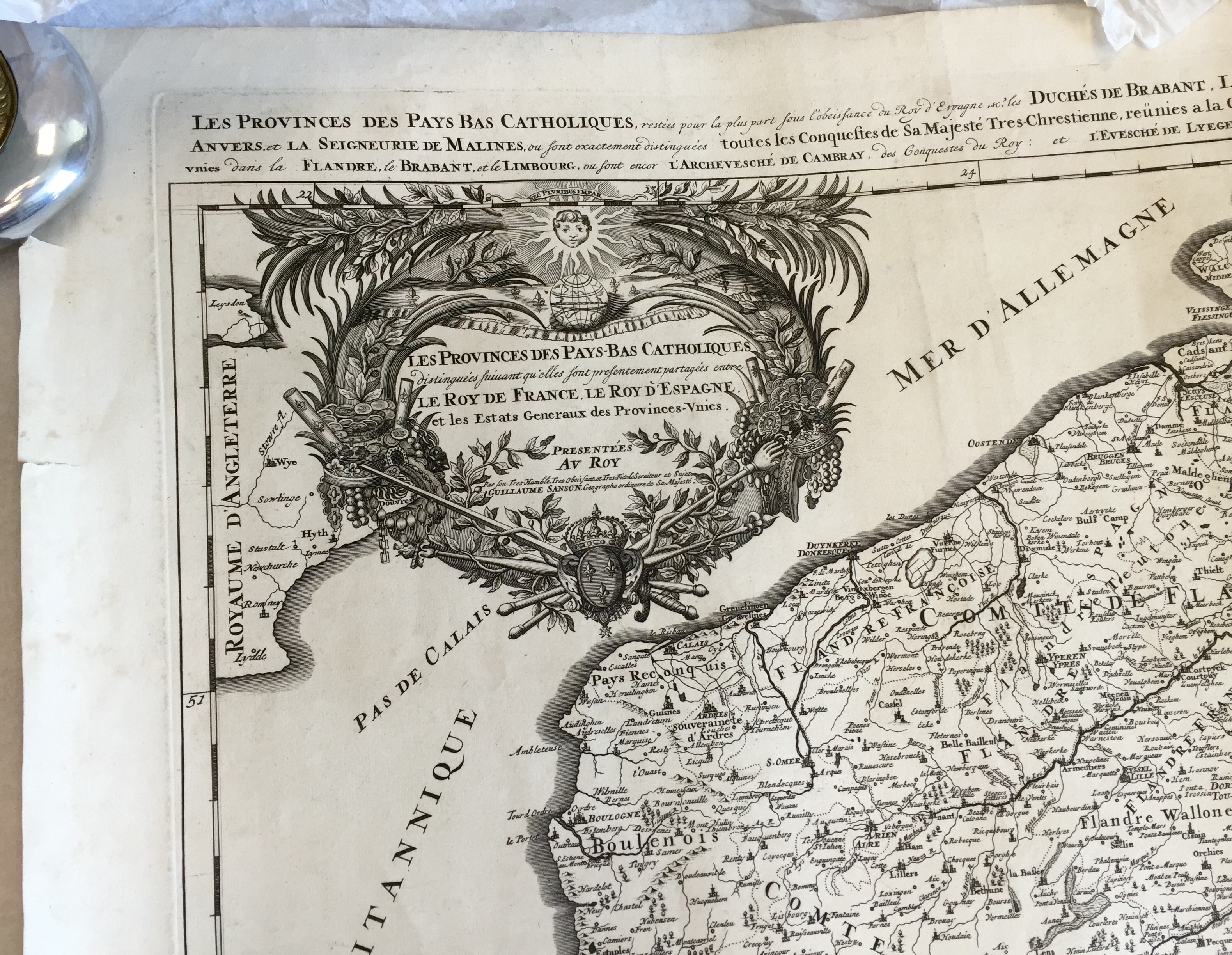
A Europeanist and a political and urban geographer, Alex is a longtime map lover. Over the past 18 months he has been occupied with copper plate engraved maps of France produced by royal cartographer Charles Alexis Hubert Jaillot. DePaul’s John T. Richardson Library holds nearly a dozen Jaillot plates in its Special Collections. All the maps will eventually be scanned and put online as part of the library’s Vincentian Maps collection. “We’re constantly getting new maps as well,” said Special Collections Vincentian Librarian Andrew Rea.
French cartographers in Jaillot’s time produced some of the world’s best atlases and maps. As maps were changed to reflect new territorial gains, they documented not only France’s physical expansion but also “the creation of a national [French] mythology based on monarchy and the Catholic Church, which Vincent utilized a lot in founding his charitable organizations,” Rea said. They offer visual evidence of “the way Vincent’s operations grew and changed the landscape,” he noted.
Like a collector and a connoisseur, Alex delights in the tactility of original historical maps, the beauty of their cartouches and the topographical features they depict. He shares that appreciation with his geopolitical classes where he brings in period maps to teach students “how to actually use material culture.”
Explains Alex, “They’re not mundane and mute objects. They speak a political language. You’re holding an artifact of France’s Siècle d’Or! There’s some magic to it that the digital version simply doesn’t capture.”