Safe passage routes to school provide not only a sense of safety for Chicago students from pre-K through high school, but they reduce crime involving students and help increase school attendance. Chicago’s Safe Passage program was introduced in 2009 after the beating death by gangs of 16-year-old Fenger High School honors student Derrion Albert, which was captured on cell phone video. His death and the circumstances received national attention along with a series of other incidents involving CPS students caught in gang violence. Since then, the program has expanded to include schools, parents, residents, law enforcement officials and even local businesses in efforts to provide students with a safe environment. The various types of safe passage programs among the 51 safe route programs currently available include: safe haven programs in which students who fear for their safety can find refuge at the local police station, fire house, library and even convenience stores, barbershops and restaurants; patrols along school routes by veterans, parents and local residents; and walking to school programs in which parents and local residents create a presence to help deter unlawful incidents.
The map below shows the number of all crimes committed in the city of Chicago during the current school year, and the locations of schools and safe routes among those communities that have safe routes. Currently, there are 517 Chicago public schools, of which, only 136 Chicago public schools (26.3% of all schools) fall within the 51 safe routes. Although the safe routes are located in 37 of the high crime communities in general (south, west and northeast sides of Chicago), they do not exist in the pockets of the highest crime incidents (1,500+ highlighted in burgundy) where children are the most vulnerable. Of the 47 schools that fall within the extreme crime areas (1,500+ incidents a year), only 6 have safe routes; the others offer no safe passage options. A list of the schools appears at the end of this blog.
Click through to see the enlarged image.

Schools located in extremely high-crime areas of Chicago (Schools highlighted in green have safe passage routes):
Bennett, Bowen HS, Bradwell, Camelot Safe – Garfield Park, Camelot Safe Academy, Clark HS, Coles, Community, Ericson, Frazier Charter, Frazier Prospective, Galapagos Charter, Great Lakes Charter, Gregory, Harlan HS, Hefferan, Heroes, Herzl, Hirsch HS, Hubbard HS, Learn Charter – Butler, Leland, Mann, Mireles, Noble Charter – Academy, Noble Charter – Baker College Prep, Noble Charter – DRW, Noble Charter – Muchin, Noble Charter – Rowe Clark, Oglesby, Plato, Polaris Charter, Powell, Schmid, Shabazz Charter – Shabazz, Smith, South Shore Intl HS, Webster, Westcott, Winnie Mandela HS, YCCS Charter – Association House, YCCS Charter – CCA Academy, YCCS Charter – Community Service, YCCS Charter – Innovations, YCCS Charter – Olive Harvey, YCCS Charter – Sullivan, YCCS Charter – Youth Development
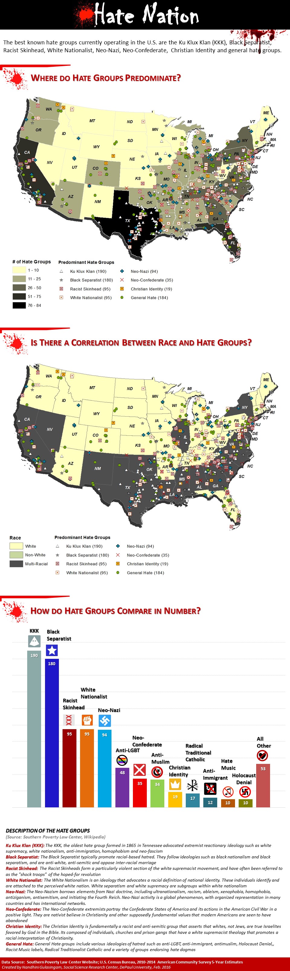
Implementing visualization techniques in faculty research
The image of the map reflects the different visualization techniques that might be used to effectively convey data or research conclusions to different types of audiences in various disciplines or industries. Visualizations can help identify existing or emerging trends, spot irregularities or obscure patterns, and even address or solve issues.
Ask us how to visualize your research
For help visualizing your own research findings or seeing if your research lends itself to similar techniques including data acquisition and pre-processing of both quantitative and qualitative data, contact Nandhini Gulasingam at mgulasin@depaul.edu.